
- Knowledge Base
- Dashboard Guides
- How to Use Creative Analytics
What is Charts in Creative Analytics?
Identify what's working and what's not with Charts in Creative Analytics
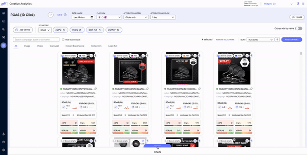
Charts allows you to compare the performance of multiple multiple ads as either a line graph or bar graph. All you have to do is:
- Navigate to the Creative Analytics page on your Northbeam dashboard
- Select up to 6 ads by clicking the checkbox labeled Show in charts
- Pull up or double click the Charts at the bottom of the page and you should be able to compare the selected ads with the key metric and additional 4 metrics selected